
Power BI's automatic date hierarchy and some curious line chart behaviour
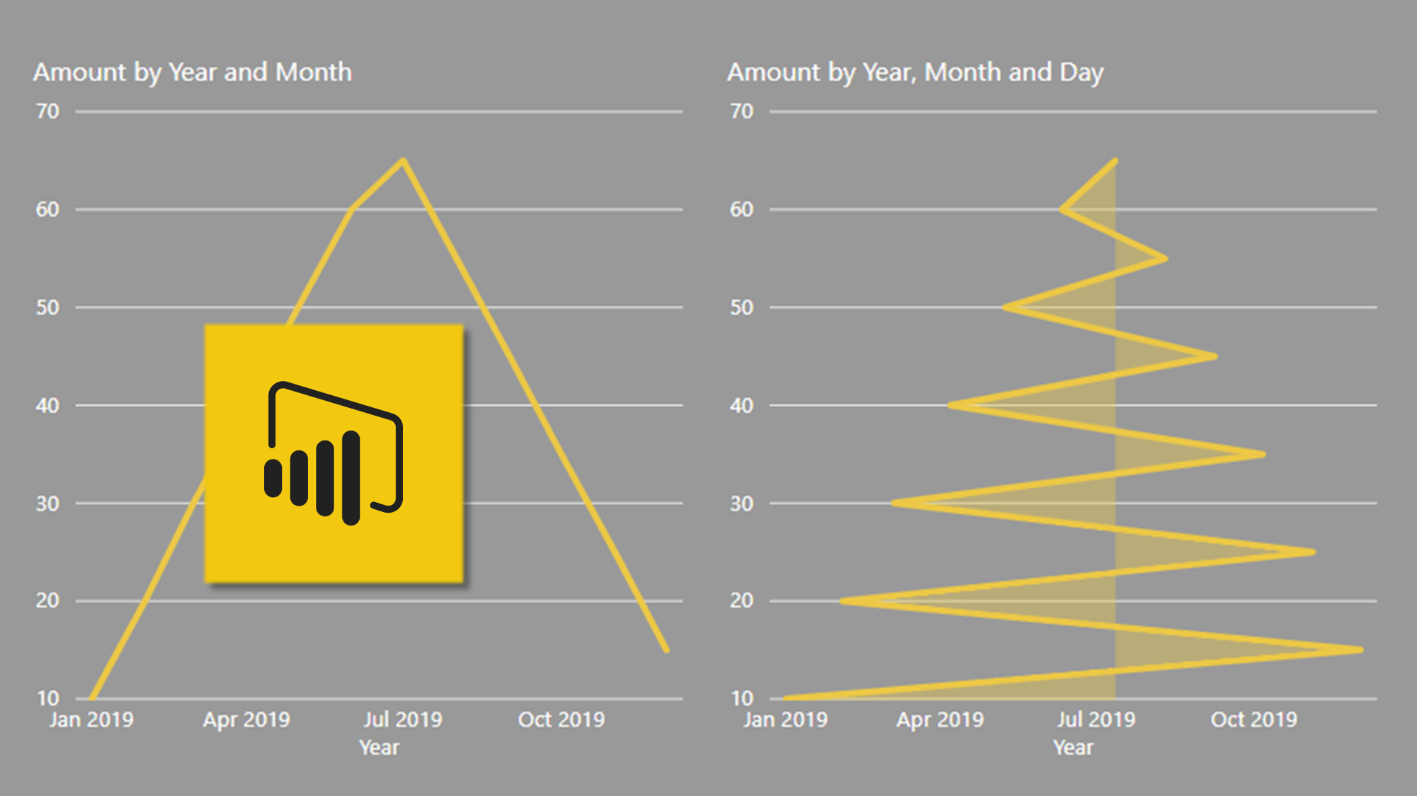
When you create a table containing dates, Power BI automatically detects they’re dates and creates you a calendar table in the background. In the fields pane you find not only the date but a hierarchy of Year, Quarter, Month and Day to use in your visuals.
It’s a great feature but beware . . . line and area charts can do some really weird things if you don’t pay attention.
This video explains what I mean and, of course, how to fix it.

Power BI's automatic date hierarchy and a line chart curiosity.